Showing posts with label embossing. Show all posts

Monday, August 9, 2021

My Creative Monday for Magenta - Embossed transparent sheet

 An easy but nice technique from me today.

t415
HOW to: 
Emboss a piece of transparent sheet. 
Color it with different colors of alcohol ink. 
While still wet, rub over the ink with a piece of paper to take color off certain areas. 
Stamp a script to a piece of cardstock. 
Adhere the colored transparent sheet onto the cardstock with script on it. 

I hope you will give this technique a try! 


Magenta products used:

Saturday, March 6, 2021

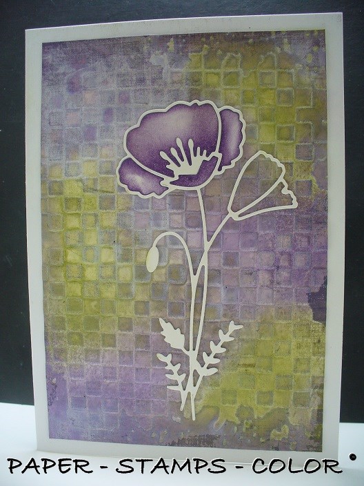
Purple shades for Flower Challenge

Happy to join in with The Flower Challenge- shades of purple

Combining the purples with green, which for me is always a color you need if it's nature themed. 
An embossing folder has been used to make the background, and distressed with distress inks. 
To make the flower pop a little more, I added more color to the inside of the diecut. 
I intend to use my dies more often... 


Friday, May 10, 2019

SCS technique cards - Graphite Transfer Paper Deboss

This technique was featured in the Splitcoast Stampers newsletter this week;
a technique by Lydia Fiedler

It is called: Graphite Transfer Paper Deboss   

I tried it, and decided to also experiment with other ways of coloring
and ended up with 4 ATC's and 3 cards.. 

Today the 3 cards! 
Vintagy.. something I do not make often.. 


****


****


Hope you  like them! 

Thursday, May 9, 2019

Technique from SCS - Graphite Transfer Paper Deboss

This technique was featured in the Splitcoast Stampers newsletter this week;
a technique by Lydia Fiedler

It is called: Graphite Transfer Paper Deboss   

I tried it, and decided to also experiment with other ways of coloring
and ended up with 4 ATC's and 3 cards.. 

(I will show the cards tomorrow )

The technique as on SCS, distress inks brayered over the embossing. 

This is a variation on the technique as I colored it with Nuance.. 

The technique as on SCS,  but now with Distress Oxides. 


The technique as on SCS;  this one turned out quite dark in the background, must be the paper.
.. also colored with Distress Oxides and sanded to expose some of the white of the cardstock again.

I enjoyed this (new to me) technique!!

Thanks SCS for sharing!

Monday, June 5, 2017

The making of ... a booklet

For Art Anthology I'd like to share the making of a booklet today, the covers particularly...

...using Colorations spray, Copper Stone Effects and Tuxedo Velvet paint.....


..although I intended to make 4 cards with embossing in combination with the beautiful sprays and paints from Art Anthology.


****
The very early stage of the background - heat embossed in clear on a clocks embossed watercolor paper.

I used corrugated cardboard for the front and back cover.

The copper metal effect adds to the stenciled words.

Time to assemble...

....the finished project. The inside pages have been cut to size from a not-used-but-second-hand photo album...


It will make for a nice and personal gift.. ..to be used as a booklet for photographs, art journaling or maybe just to make some notes.

Did not know I was going to end up with this :)
LOVE it...

****
For more pictures and a step-by-step please have a look at the Snapguide tutorial I've created for you: Check out How to Make Mixed Media Covers for a Booklet by Art Anthology on Snapguide.


Have a good day! 

I am entering this in the challenge on

1. Simon Says Stamp - masculine

Wednesday, November 16, 2016

A special occasion


I am entering this in the challenge on 
1. The flower challenge - a special occasion


Tuesday, April 26, 2016

12 tags of 2016 - April


My tag for the April challenge in the 12 tags of 2016 from Tim Holtz!

I've matted the tag onto black cardstock- gives it some more definition! 
... pssssst - and to be honest, the backside of the tag was not clean after all the messiness, so this way nobody will ever know that! 

As you might notice, I've used white paper as base for the mosaic. 
LOVE the technique.. 

Thursday, February 4, 2016

A ray of sunshine ..

If this reflects the start of spring, I would be happy!
The sentiment is from Inkerbell Stamps 
Background script stamp is from Magenta

****
I am entering this in the challenge on 
1. Simon Says Stamp - Ray of sunshine

Saturday, August 15, 2015

Saturday, May 24, 2014

Butterfly, flutter by please...

 I know, these are unusual colors for me... but I have to use all my supplies, don't I?
I've used 'Te gekke krijtjes' (yellow and white) to make a resist after I embossed the cardstock, and before spraying it.  

I am entering this in the challenge on
1. Butterfly challenge - I used these 3 : pink, butterfly and embossing
2. Te gekke krijtjes 


****
STAMPS USED: (click on picture)

Wednesday, March 26, 2014

Framed flowers.

I used the 'Te gekke krijtjes" on the embossed frame, with different colors.
It acts as a resist for inks etc. 
I sprayed over the frame with some custom made pearl spray in a blue tint.

 I am entering this in the challenge on 


STAMPS USED: 
 Paper Artsy


Friday, February 7, 2014

12 Tags of 2014 - February

I am entering this in the challenge of Tim Holtz : 12 Tags of 2014 - February
and
for the challenge on The Artistic Stamper - use distress

Thursday, January 23, 2014

Pan Pastel en perkamentpapier, en een collagestempel


Ik wilde eens uitproberen of Pan Pastel ook een mooi effect geeft op perkamentpapier. Nou, dat gaat dus helemaal prima, ik was blij verrast met het resultaat. Ik heb het perkament eerst door de Big shot gehaald met een embossingfolder. Om te voorkomen dat het perkamentpapier scheurt bij het embossen heb ik aan beide zijden printpapier erbij in gedaan. 
Gebruikte kleuren :
Panpastel Chromium Oxide Green 660.5 
 Panpastel Bright Yellow Green 680.5

****


Bij deze voorbeeld heb ik een grote collagestempel gebruikt. Ik vond het grote voldoening geven, te zien dat je zelfs op zo'n grote vlak, de mooiste kleurnuances krijgt. 
De tekst is gedaan na het fixeren van de Pan Pastel op de collagestempel. 
Gebruikte kleuren :
Panpastel Red Iron Oxide 380.5
Panpastel Bright Yellow Green 680.5, 
Panpastel Bright Yellow Green Tint 680.8
Panpastel Phthalo Green 620.5.
****
Alle gebruikte stempels zijn van Magenta. 


Wednesday, December 18, 2013

Panpastel en embossing

A tutorial for you: PanPastel and embossingfolders!
Ik heb een tutorial voor jullie, werken met PanPastel en embossingfolders. 


****


Emboss you cardstock with the embossing folder. Dab with versamark ink over the embossed image. It will make the PanPastel stick better to the paper, and make it more intense!
Zoals anders, emboss je je cardstock met de gewenste embossing folder. Met de embossing inkt pad ga over het geëmboste afbeelding gaan.  Dat zorgt dat de PanPastel beter hecht (= intensere kleuren).

Start coloring with the lightest color, for me it's Brighr Yellow Green 680.5
Don't color the leaves all over; leave some white! 
Begin nu met de lichtste kleur PanPastel in te kleuren, in mijn geval 680.5 Brighr Yellow Green.
Laat ook lichte vlakken open. 
 Color with a darker color, just touches. I used  Permanent green; 640.5, Again, don't color leaves all over; leave some white!
 Ga dan kleuren met een donkerder PanPastel, hier 640.5 Permanent green; nog steeds lichte vlakken laten.
 Now to the darkest green Chromium Oxide green shade 660.3, to create depth. More depth has been created because I left lighter parts on the leaves. 
The berries have been colored with 380.5.
and the edges of the cardwith the lightest green, 680.5
 Nu gebruik je de donkerste groen, 660.3 Chromium Oxide green shade, om diepte te geven. Zoals je kunt zien zijn de bladeren niet helemaal ingekleurd, nog steed lichte vlakken. Dat geeft diepte.
De bessen zijn gekleurd met 380.5.
De randen met de lichtste kleur, 680.5


Fixate when you've finished coloring.
In de achtergrond heb ik een afdruk gemaakt van een gedeelte van een muziekstempel.
Of course this technique could also be used to create gorgeous backgrounds with a background embossing folder!
Alles uiteraard fixeren wanneer je klaar bent met kleuren.  
In de achtergrond heb ik een afdruk gemaakt van een gedeelte van een muziekstempel. 
Deze techniek is ook heel goed te gebruiken om mooie achtergronden te maken, met een achtergrond embossingfolder.

****

Another idea: a box full of techniques.... .
Ik heb verder nog een idee voor jullie: een techniekendoos...

I created a box from cardboard to hold ATC-sized cards.
At the moment this box contains over 200 technique cards.
On the backside of each technique card, I wrote a short how-to of the technique.
The technique card that I added for today's technique is this one.
On the back there is also a number, in this case nr 203. On my PC I've got a folder with pictures of all the techniques, sorted by number. Easy to find now!
Maybe you also find this idea handy, to never forget all the techniques you discover while playing.

From now on I will post the technnique card I put in my technique box for PanPastel, under the blogpost.

Ik heb een doosje, langwerpig, (zelf op maat gemaakt) waar zo'n 200 technieken in staan, allemaal op ATC formaat. Op de achterkant ervan staat een korte beschrijving.
Voor de techniek die ik vandaag gebruikte, gaat dit techniekkaartje in de techniekenbak, techniek nr 203 voor mij. Alle technieken staan op nummer, en een foto op de computer met deze zelfde nummer, voor het gemakkelijk vinden van een bepaalde techniek. 
Misschien vinden jullie dit wel een handig idee?!

Vanaf nu zet ik ook het techniekkaartje dat in mijn techniekendoos gezet wordt voor PanPastel, onderaan mijn blogpost.

Monday, July 1, 2013

Mail Time!

Yet another new challenge at FSC - mail time! 
This theme fits me a lot, LOVE it! 
Come join us, there is a prize from Flonzcraft!


STAMPS USED: 
Stampers Anonymus