Showing posts with label PanPastel DT. Show all posts

Friday, March 20, 2015

Voorjaarsbloemen...

De nieuwe challenge bij Pan Pastel BNL, dat al weer 4 dagen oud is. 

Ik heb de 2 woorden uit elkaar gehaald, voorjaar en bloemen. 
Het voorjaar kenmerkt zich altijd met zulke mooie groene tinten. En bloemen horen natuurlijk helemaal bij het voorjaar, maar deze bloemen laten zich pas zien in Augustus, dus geen voorjaarsbloemen, en zijn nooit groen.... Artistieke vrijheid?  

Springflowers..the new theme at Pan Pastel BNL. 
I chose to cut the 2 words into spring and flowers... spring always comes with beautiful shades of fresh green, and flowers always come with it too. These flowers never show up in spring, but only in August, so no spring flowers, and never green... 
Artistic freedom? 

Voor deze kaart heb ik een aantal groene kleuren PanPastel gebruikt/ 
I used the following green colors
Panpastel Bright Yellow Green 680.5
Panpastel Permanent Green 640.5 
Panpastel Permanent Green Shade 640.3
Panpastel Chromium Oxide Green 660.5 
Panpastel Phthalo Green 620.5

****
I am entering this in the challenge on 
1. Indigoblu -  spring greens
 I knew I was going to use this beautiful image, with a hint of green for your challenge, and when I saw the theme at PP BNL, I knew I had to... . 
Just a pity I had to wait so long to show it to you as I could only show this on my blog today..  (my DT day)

Monday, March 2, 2015

Birds and summer...

... it's time for them both, because that will mean spring is on its way!

The background was first primed with gesso, and then scratched into with the wood of a waterbrush. It gives the beautiful structure on the bird when I stamped on it (a happy accident, yes!)

So ... keep playing, and accidents happen anyway, so make sure they're happy ones!

Saturday, November 15, 2014

Color challenge for PanPastel BNL !

Our very first challenge at PanPastel BNL! COME join in!


We are to use a colorscheme, you can find it at the end of this post. 

 YES, sometimes I so LOVE to work with a paper napkin to make a collage. 
I made an art journal page about being grateful!
We sometimes forget to say thanks... most of the times we look at what we don't have; we should concentrate on what we do have!


I LOVE the effect of the PanPastel, so soft and gentle to fit the image. I chose to keep it subtle in colors, with only a few details.


HOW TO:
1. Choose a paper napkin with a print. Tear the part you want to use out of the paper napkin. (Don't cut it with scissors, because then the edge will be much more visible).
2. Glue it with decoupage glue to your art journal page.
3. Dab some gesso with a sponge over the background to get a mottled effect, and to cover up the edge of the paper napkin.
4, Color with PanPastel. (The paper napkin was only the print in brown).

I used the following PanPastel colors: 
Panpastel Turquoise 580.5
Panpastel Phthalo Blue Tint 560.8
Panpastel Turquoise Shade 580.3
Panpastel Raw Umber Shade 780.3 (for her hair) 


I am entering this in the prompt for Journal52 for week 33 - gratitudes

STAMPS USED:
Art impressions

Monday, November 3, 2014

Ach, wat maken vlinders me altijd blij !


Dit kaartje heb ik een poosje geleden al gemaakt, tijdens de demo in de winkel "Leuke Stempels" van Hella,
This card has been made a while ago, when doing a demo in a local Dutch shop, "Leuke Stempels" from Hella (she's also got a webshop, hint). 

****
HOW TO: 
Stempel de vlinder van Indigoblu in zwart op een tag en op een kaartkarton. 
Kleur de vlinder met verschillende kleuren gele en rode PanPastel. 
Stempel tekst (van Joy crafts) in de achtergrond, en kleur het met verschillende kleuren groene, gele  en rode PanPastel. Kleur ook gelijk het achtergrondje mee.
Stempel de script ook op het kaartkarton in zwart. 
Door rood over groen te gebruiken, krijg je een mooie intense kleur, tegen bruin aan (kleurenleer!)
Breng accenten aan in wit met een Molotow marker. 
Bevestig mooie fibers in de kleurstelling van de achtergrond aan de tag. 
Bevestig alles op de kaart zoals getoond!

HOW TO: 
Stamp the butterfly from Indigoblu in black on a tag, and also on the card it's going to be attached to. 
Color the tag with various colors red and yellow PanPastel. 
Stamp the script (Joy Crafts) in the background with Versamark, and color it with various colors red, yellow and green PanPastel. Also create a darker (almost brown) color by going over the green with red, and vice versa.  (Colorwheel!)
Add some white accents with a white Molotow marker. 
Attach fibers to the tag, in the colors of the tag. 
Adhere it all to the tag as shown. 


Saturday, November 1, 2014

New challenge for Katzelkraft - GESSO !


 New challenge for Katzelkraft - GESSO ! 
There is a voucher to be won every month!  SO, what are you waiting for?


I LOVE to work with gesso. 


I'll tell you how to make this: 
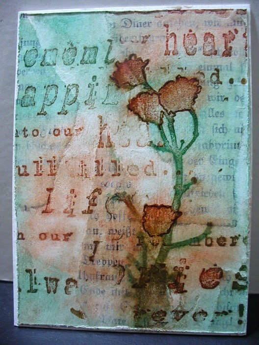
1. Start by adhering torn pieces of bookpaper to cardstock.

2, Cover it with gesso with an old creditcard, or similar tool. 
Leave to dry. 

3. Sponge with PanPastel. 
I used the following colors:  Red Iron Oxide 380.5, Panpastel Phthalo Green 620.5 and Panpastel Permanent Green Shade 640.3
To get more intense colors, swipe some Versamark over parts of the background. 

4. Stamp the images with a dark brown solvent ink. Fussy cut the images. 
Color it with PanPastel as well. 

5. Adhere the images to the background. Also add a mini brad to make it look as if  it's hanging on the card. 

DONE!


STAMPS USED: (click on picture)

Tuesday, October 14, 2014

Printables are so nice to use with PanPastel !

You can see how I used the new blender here... it blended the reddish colors beautifully. 
The pearlescent colors give it a gorgeous shine! The printables are from Prima.  

The background has been created with Glimmer mist. 
I made these while on vacation, I only brought these sprays (also from Colorwash) and a lot of blank cardstock. I sprayed it on the table outside in the sun near the tent. A bucket of water, water in a spray bottle and room in the tent to let them dry, is the only thing you need! O, yes - and a fork to scratch the paper, grin. People on the camping asked what on earth I was doing. I created about 100 new marvellous backgrounds, ready to use in my projects. 

I used the following PanPastel colors:
Panpastel Magenta 430.5
Panpastel Chromium Oxide Green 660.5
PanPastel Colorless Blender 010    
PanPastel Pearlescent Red 953.5
PanPastel Pearlescent Green 956.5

This is going to be my technique card for my technique-box:

Thursday, September 25, 2014

Printing and coloring,,,,

 Just print a digital collage, color it with Pan Pastel, and VOILA... a beautiful card. 
The real advantage with PanPastel being dry, it won't bleed the print.

Here I used the digital print I got from Gail at the Shabby Cottage Studio website.
LOVE this print! 


I've used the following colors: 
Panpastel Red Iron Oxide Shade 380.3
Panpastel Permanent Red Tint 340.8
Panpastel Phthalo Green 620.5

I am entering this in the challenge on 
1. Simon Says Stamp - anything goes

****
This is the technique card I've created for my technique box. 
I've stamped the script on this one.

Saturday, September 13, 2014

Monoprint plus PanPastel...


......is a gorgeous combination. 

The blue is PanPastel, the shadow and the script. 
The monoprint already had a little bit of blue, so that's why I added this with a blue shade PanPastel -  Panpastel Phthalo Blue Shade 560.3

****

STAMPS USED:

Thursday, August 14, 2014

Leaves and script....

 As far as I concerned, this is new. 
PanPastel sticking to white heat-embossing. 
I started off with a dark blue cardstock, and my intention was to color the background only. 

BUT, it sticks to the embossing! I used white embossing powder from Stampendous, maybe other brands won't give the same result. 


COLORS USED:
Panpastel Phthalo Green 620.5
Panpastel Hansa Yellow 220.5
Panpastel Raw Umber Shade 780.3

STAMPS USED:
Hero Arts

I am entering this in the challenge on
1. Simon Says Stamp - summer
2. OCC - summertime 
3. Artistic Stamper - anything

****

Technique card:
(on the backside a description for future reference)

Friday, July 25, 2014

Clocks...

I've been playing with these Magenta stamps in July... I needed a christmas card for a challenge and this is also my DT piece for Pan Pastel BNL for today... I don't like when people create christmas cards in July, so this is to punish them, LOL.
PanPastel colors used:  : 
Panpastel Bright Yellow Green Tint 680.8
Panpastel Bright Yellow Green 680.5
Panpastel Permanent Green 640.5
Panpastel Red Iron Oxide 380.5
****
I am entering this in the challenge on
1. Stampotique -  'Christmas in July' 


This ATC sized card is going into my technique box:

Personally I like this one most, don't know whether that's because of the paper, or the embossing powder I've used.

Monday, July 7, 2014

Flowers for you...

... on vellum. 
It's great to color vellum on the back. I heat embossed the flowers with white embossing powder. 
I used the following PanPastel colors:
Panpastel Yellow Ochre 270.5 and
Panpastel Phthalo Green 620.5

(The stamps are from Stampinback)

I am entering this in the challenge on
1. Stampinback - CAS

Monday, June 16, 2014

Het gebruik van Pan Pastel op verschillende soorten papier....

Vandaag een foto-tutorial voor jullie! 

****
De stappen die ik laat zien zijn dus steeds herhaalt, op 3 verschillende soorten papier van Schoellershammer (voor de volledigheid):
 een 200 grams glad 'drawing and painting paper no 8', 
300 grams grof aquarelpapier no 12
en een 'drawing and painting paper no 2' (is een kraftkleur), 

Ik ben begonnen met het afdrukken van de bloem van Studio Light:

Van dezelfde afbeelding knipte ik een maskertje uit post-it papier. 

... en legde dat op de bloemafdruk... 

 ...om een tekst 'Flowers' in het achtergrondje te kunnen stempelen. Hier zie je het resultaat op de verschillende soorten papier. 

Ik koos voor verschillende blauwtinten, 
en begon met de lichtste, Panpastel Phthalo Blue Tint 560.8 

 Als 2e kleur de Panpastel Turquoise 580.5
 om wat meer accent rond het hartje aan te brengen, en in de schaduwpartijen. 


Als 3e kleur de Panpastel Turquoise Shade 580.3, om de kleuren toch nog weer een iets andere tint te geven, en de schaduwgedeeltes nog meer te accentueren. 

Tja, en dan mag ook het hartje van de bloem iets meer aandacht, en dat heb ik aangebracht met de Molotov One4all 1mm acrylmarkers; geweldige markers, gelijkmatige vloeiing van verf! 
Breng het wel wat subtiel aan, anders wordt het té!

De bladeren heb ik een hint van een groene kleur gegeven, om het blauw als hoofdkleur te behouden. Het is Panpastel Bright Yellow Green Shade 680.3

 Ik bracht een scheurrandje aan, en kleurde dat met de eerder gebruikte kleuren, van boven naar beneden in de tinten die op de foto ernaast liggen. 
 ****

HET RESULTAAT: 
 op het 200 grams glad 'drawing and painting paper no8: 
Dit was met het inkleuren met Pan Pastel mijn favoriet boven het grove aquarelpapier, mooi gelijkmatig, en ook prima te blenden met de donkerder kleuren. 

 300 grams grof aquarelpapier no12:
voor aquarelleren helemaal prima, maar voor werken met Pan Pastel wat mij betreft te grof. Het blenden gaat iets minder goed, je hebt gauw dat het pigment op sommige plekjes beter hecht, en dat geeft een minder gelijkmatige dekking. Kan mooi zijn, maar in dit geval niet mijn eerste keus. 

en op de 'drawing and painting paper no2' (kraftkleur)
Tja, zeg nou zelf, dit geeft een WOW effect. Dit krijg je niet zo mooi met welk ander medium ook, wat mij betreft springt deze kaart in de serie van 3 er bovenuit. De kleuren liggen er zo mooi op en ja, in het echt zie je dat dus beter. 


Ik hoop dat jullie vandaag weer geïnspireerd zijn!!

****
I am entering this in the challenge on
1. SSS Monday challenge - anything

Monday, May 26, 2014

Button up your heart...


 Just a sneak peak of my DT piece for the PP BNL blog
If you want to see more, go have a look there!

Een sneak peak van mijn DT creatie vandaag op PP BNL.
Voor meer details, ga er even kijken. 

Wednesday, May 7, 2014

Panpastel and bookpaper

Voor mijn nederlandse volgers - de tekst staat in het nederlands op het Pan Pastel BNL blog


Today I had a play with Pan Pastel and some NEW stamps from Magenta

HOW TO: 
Start by tearing up some bookpaper and adhere that to your cardstock. 

Add a layer of gesso with a creditcard, twice, dry in between. 

Stamp the main image with versamark and sponge with Pan Pastel. Fixate. 

To get the background, take up some dry blue and green Pan Pastel with a brush and tap it on the background. Mist it with some water and let it run.  To get the cloudy effect, just dab some off with a dry cloth. 

Stamp the sentiment as shown and highlight the edges of the bird and the letters with a white gelpen. 

Stamp circles with gesso. (I used the lid from goosebumps)

I am entering this in th echallenge on
1. Country View challenges - Nature's glories
2. TIOT - springtime

PRODUCTS USED:

PanPastel - 
Panpastel Red Iron Oxide 380.5
Panpastel Ultramarine Blue Shade 520.3
Panpastel Permanent Green 640.5
Panpastel Bright Yellow Green 680.5
Panpastel Bright Yellow Green Tint 680.8


Magenta: (click on picture)


This is the technique card I've created for this technique:


Thursday, April 17, 2014

Pan Pastel en .. crackle paint

HOW TO: 
Stamp or draw a heart, and fill it up with distress crackle paint, doesn't really matter which color you use, as you are going to cover it entirely with Pan Pastel.
 I had a happy accident here, as I was too impatient to let it dry all by itself, and it formed a bubble underneath the top layer of the crackle paint. It fell off in the next step. 
Rub some Pan Pastel in the cracks with your finger, and color the crackle paint too this way (or leave some areas the original color - your choice!) 
Fixate the pastel. 
Finish it off as shown, some accents of color and script in the background. 
****
Kleuren gebruikt: 

Panpastel Bright Yellow Green 680.5
Panpastel Red Iron Oxide 380.5

(Script stamp is from Art Journey)

Friday, March 28, 2014

Pan Pastel time!


stamps are from /stempels zijn van Unity en/and Paper-Artsy.

This is how you can make these two cards:
1. Sponge the background with Bright Yellow Green 680.8 and Turquoise 580.5.
2. Stamp the picture with a solvent black ink. 
3. Color it with a small brush. Take up the pigment from the pans with the brush (dry-without water!).
I used the colors Red Iron Oxide 380.5 and Chromium Oxide Green 660.5
4. Fixate. 
5. Stamp the script in the background with a lighter black solvent ink. 
6. Finish it off like shown. 

Zo maak je de kaart en de techniekkaart:
1. Spons het achtergrondje met de kleuren Bright Yellow Green 680.8 en Turquoise 580.5.
2. Stempel de afbeelding met een zwarte watervaste inkt. 
3. Kleur de afbeelding door het pigment van Pan Pastel op te nemen met een penseeltje (LET WEL : niet met water, gewoon droog), en daarmee te kleuren. 
Ik gebruikte de kleuren Red Iron Oxide 380.5 en Chromium Oxide Green 660.5
4. Fixeren.
5. Stempel script met een lichtere zwarte watervaste inkt. 
6. Maak de kaart verder af, zoals te zien is op de foto. 

This technique card is numbered 219, for my technique box. 
The stamps used here are from Magenat (the swirly flower is from my own design at Magenta). LOVE it!
Dit kaartje gaat als nr. 219 in mijn techniekenbak!
Stempels zijn van Magenta (swirly bloem van ondergetekende)

Saturday, March 8, 2014

Lifetime memories...

It's beautiful weather here in the Netherlands; it inspired me to use some sunny summer colors on this art journal page. Look how beautuful it is to use Pan Pastel on bigger areas (flowers) and  I also LOVE the effect of Pan Pastel on structure paste. 
Helemaal in de ban van het mooie weer gebruikte ik zomerse kleuren op deze Art Journal pagina. 
 Hier kun je zien hoe mooi het is om Pan Pastel te gebruiken op grotere vlakken (bloemen). Ook is het effect heel mooi op stuctuurpasta. 

Here you can see the effect of using Pan Pastel on structure paste, a very intense color. 
 Hier kun je zien hoe mooi Pan Pastel hecht op stuctuurpasta, meer als op omliggende vlak. 


Used Pan Pastel Colors / Pan pastel kleuren gebruikt: 
Panpastel Hansa Yellow 220.5 ,
Panpastel Permanent Red Shade 340.3, 
Panpastel Bright Yellow Green 680.5, 
Panpastel Yellow Ochre 270.5, 
Panpastel Phthalo Green 620.5

****
STAMPS USED:
Script - Magenta (Ellie Knol designs)

Monday, January 27, 2014

Pan Pastel and some fun with heat embossing

 
The finished card / het afgewerkte kaart

****

A step- by- step
een stap-voor stap
This is what the scrapbookpaper looked like before I started coloring it. 
Zo zag het scrapbookpapier er uit voordat ik het begon te bewerken.

Heat emboss the bold image with clear embossing powder. Add a layer of watered down gesso. 
Heat emboss de afbeelding met versamerk en clear embossing poeder. Verf eroverheen met een waterverdunde laag gesso. 


 Color the background with different colors Pan Pastel. I used a dark color at the bottom of the flowers, to add some shading. I used the following colors: : Panpastel Phthalo Green 620.5 and Panpastel Yellow Ochre 270.5
The colors I used are Panpastel Phthalo Green 620.5 and Panpastel Yellow Ochre 270.5
Kleur de achtergrond met verschillende kleuren Pan Pastel. Ik gebruikte een donkerder kleur voor schaduw aan de onderrand van de bloem. Gebruikte kleuren zijn : Panpastel Phthalo Green 620.5 en Panpastel Yellow Ochre 270.5

 Stamp randomly over the background.
Stempel de script op de achtergrond.

I also added some script with versamark and Panpastel Red Iron Oxide 380.5
Now for the magic to happen:: 
Using a piece of scrap paper, iron the clear embossing off of the scrapbookpaper. Now the original color of the scrapbookpaper gets revealed.
Stempel ook nog de script met versamark en kleur het met Panpastel Red Iron Oxide 380.5. 
Nu komt het tovergedeelte: 
Gebruik een stul afval (printer) papier en strijk de clear embossing er af. Nu komt de originele kleur van het scrapbookpapier weer tevoorschijn. 

****

A close-up / een close-up: 
Here you can see I added some black and white highlights to make the image pop even more.
Hier kun je zien dat ik ook nog wat accenten heb aangebracht met een zwarte en witte gelpen

****
STAMPS USED: / GEBRUIKTE STEMPELS:  
Magenta (Ellie Knol designs): click on picture
https://www.magentastyle.ca/store/product_info.php?cPath=398_492&products_id=15401&osCsid=h9cdb269m24epmc4setf2j6k71